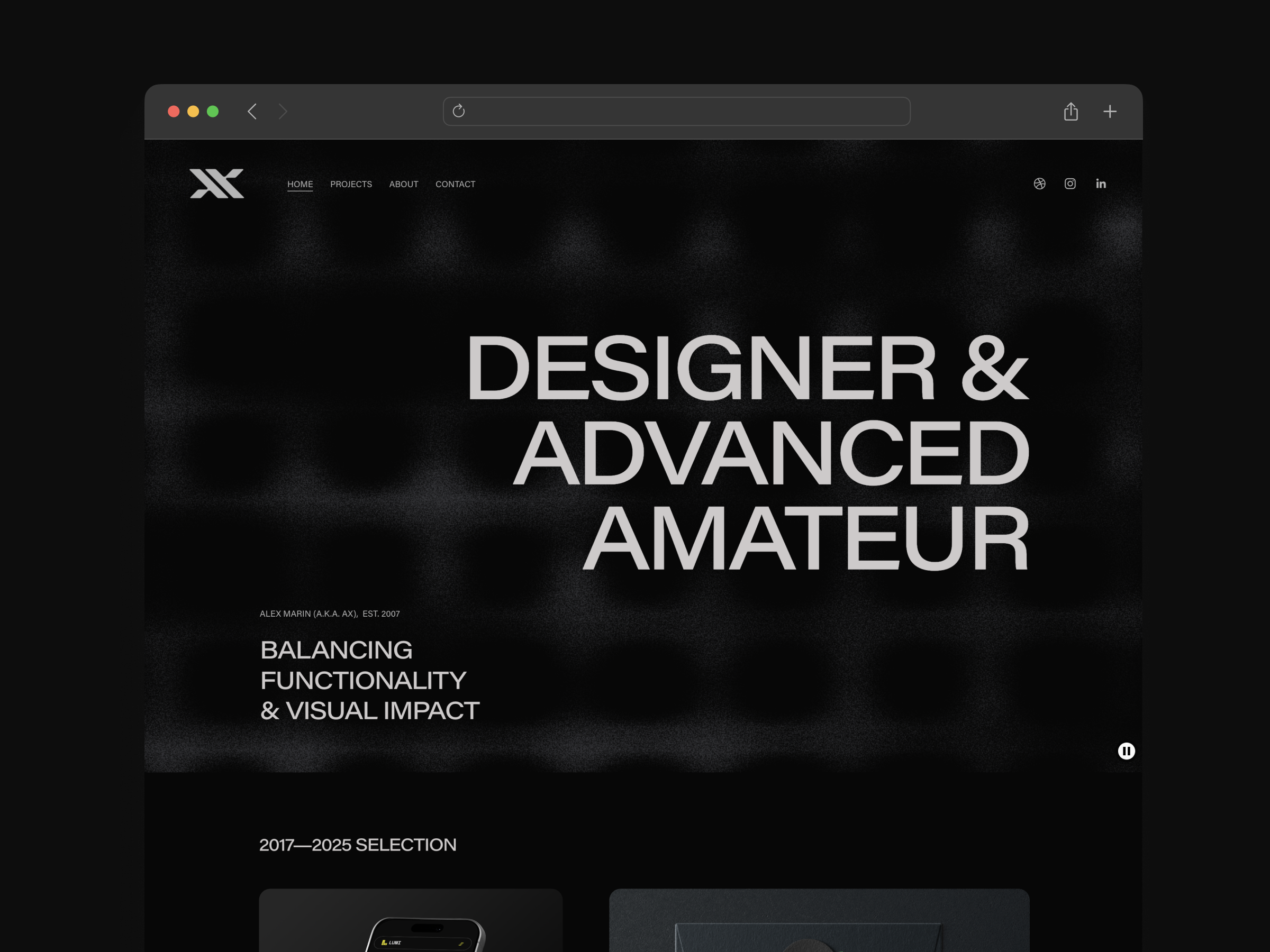
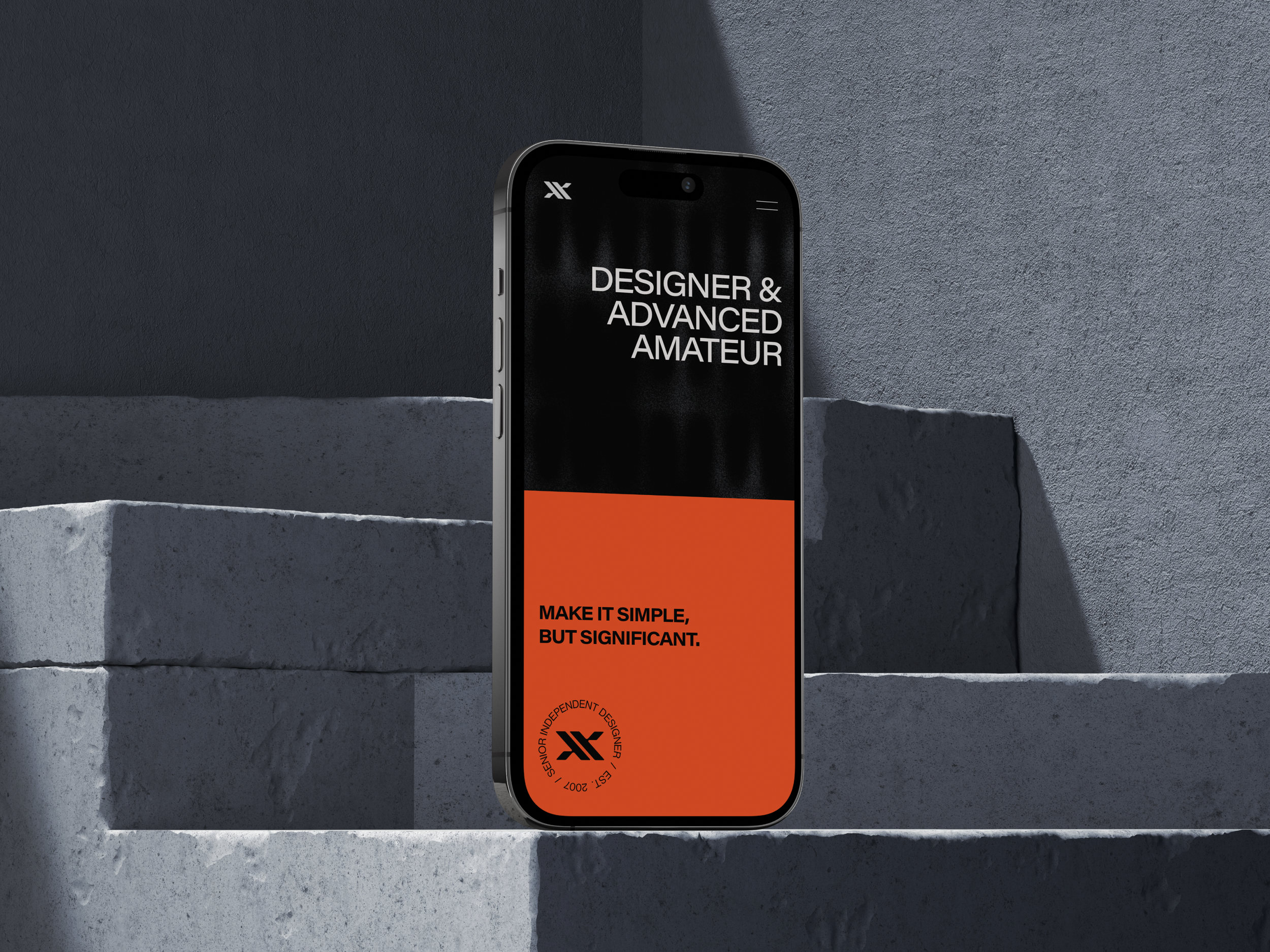
AX / alex.mn has been a multi-disciplinary designer for over 15 years, working across brand identity, user experience, and digital products.
BRAND IDENTITY
RESPONSIVE WEB DESIGN
HQ: LONDON, ENGLAND

Background
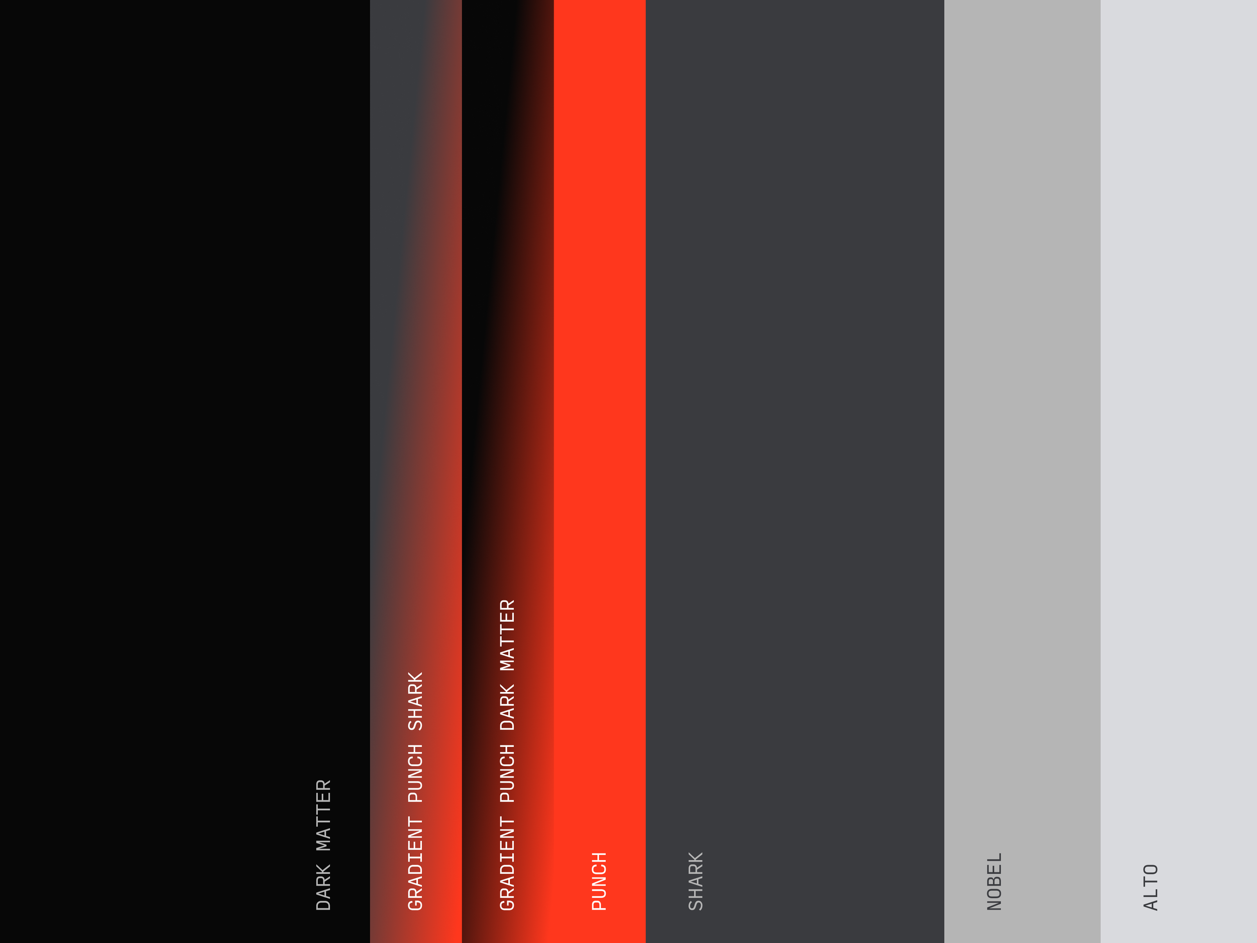
The AX emblem is designed as an ambigram, derived from my name, ALEX.
When viewed from a distance, it morphs into an X, symbolising precision and focus towards targets.
The red accent symbolises courage and passion, reflecting changes that drove me towards recently becoming an independent designer after having worked for different agencies and companies for the past 11 years.